

SWALOU PROJECTS
Showcase of Work
My portfolio of projects is very diverse as I always like to take on new challenges.
This range of work shows that I like to be versatile and always play with visual texture, colour and type.

PLATED CONVENIENCE REBRANDING
Branding
I was tasked to rebrand Plated, a wonderful brand
producing healthy flash-frozen meals, delivered to your doorstep. The new branding is clean and fresh, yet has a playful youthfulness to it, especially the Plated Kids sub brand. The branding stretched from logo creation, packaging design, social media content creation and billboard design.


UNATHI REBRANDING
Branding
I was tasked to rebrand Unathi, an auditing firm in the heart of Pretoria with deep rooted values. The new branding is a combination of modern and classic design, with an afrocentric feel to it.
Unathi means God with us and so the logo mark does not only serve as a monogram 'u' for Unathi, but also forms the symbol of a dove in its structured round shapes.


EETGOED ILLUSTRATION DESIGN
Branding illustration
I was tasked to create visually enticing watercolour illustrations for eetgoed. These were then applied to menu layouts and social media posts. Later these illustrations were used to create branding for a refrigerator.


CELVI CORPORATE IDENTITY
Branding
I was tasked to create a full corporate identity for the first stem cell donation bank in South Africa. The brand is personal and tries to tune into the emotional bit of family-forming. The CI covered print and web design and all illustration work.

CASTLE GATE LOGO DESIGN
Branding
I was tasked to create a logo for Atterbury's new local development. The logo and marketing designs around it had to be inline with the tagline -The art of development. The design pays homage to the grounds the development is found on and is modern and edgy in its clean lines.


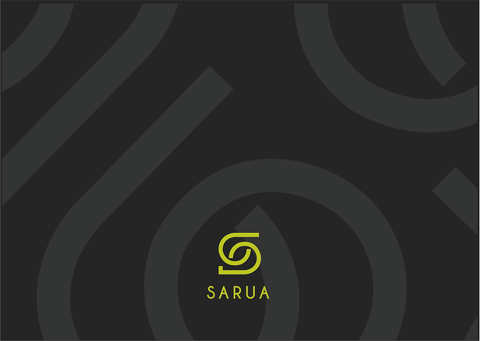
SARUA REBRANDING
Branding
I was tasked to rebrand SARUA into a more dynamic brand, speaking to themes of collaboration, unity and harmonisation. The logo can be seen as hands shaking - symbolising a coming together, which is integral to the brand as a whole, as SARUA represents many university groups coming together.
The design is simplistic and can speak to a large audience.

FINYEZI CORPORATE IDENTITY DESIGN
Branding
I was tasked to create a afrocentric brand for an integrity testing firm. The brand rocks between a formal corporate feel and a more playful edge. The branding is developed to apply to a whole range of platforms and is relatable to a South African market.
